Contrary to popular belief, teaching a child about color isn’t about memorizing the seven colors of the rainbow. It’s about handing them an artist’s lens to see the world differently. This guide shifts the focus from naming colors to exploring their relationships, feelings, and the pure magic of creating something new. We will move beyond flashcards and into the studio, treating your child not as a student to be tested, but as a fellow artist on a journey of chromatic discovery.
As parents, we often begin our child’s journey with color by teaching them a song about a rainbow or pointing to a fire truck and saying « red. » We celebrate when they can correctly name the primary colors. But as an artist, I have to tell you, this approach misses the entire point. It’s like teaching someone the alphabet but never showing them how to read a story. You’re teaching facts, not feeling. You’re building a vocabulary, not a language.
The common methods treat color as a static, compartmentalized list of things to memorize. This can inadvertently strip the magic away, turning a vibrant, emotional world into a multiple-choice quiz. We connect color to objects, but we often fail to connect color to emotion, to other colors, or to the child themselves. The real lesson isn’t just that blue and yellow make green; it’s the gasp of wonder when they see that transformation happen under their own hands.
But what if we shifted our perspective? What if, instead of teaching colors, we started exploring them together? This guide is about adopting an artist’s mindset. It’s about moving from « what is this color? » to « how does this color feel? » and « what happens when it meets another color? » We’re not just making a mess with paint; we’re conducting experiments, we’re telling stories, and we’re learning to see the world with more depth and nuance.
Throughout this guide, we will explore a series of hands-on, process-oriented projects. Each one is designed to reveal a fundamental principle of color theory not as a rigid rule, but as a living, breathing part of our visual world. Get ready to go beyond the rainbow and discover the artist within your child—and maybe within yourself, too.
Summary: Teaching Color Theory Beyond the Rainbow Song
- Mouse Paint: Mixing Red, Blue, and Yellow to Find New Colors
- Paint Chip Match: Matching Toys to Hardware Store Color Cards
- Warm vs Cool: Why Blue Feels Cold and Red Feels Hot?
- Opposites Attract: Complementary Colors on the Color Wheel
- Nature’s Palette: Finding Camouflage and Warning Colors Outside
- Sensory Art: Finger Painting and Shaving Foam Tracing
- Nature Scavenger Hunt: Finding Textures, Colors, and Shapes
- Artistic Expression: Using Art to Say What Words Can’t
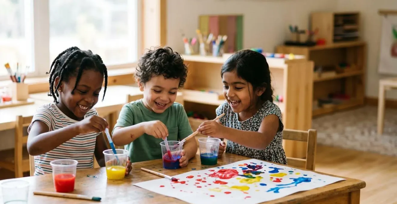
Mouse Paint: Mixing Red, Blue, and Yellow to Find New Colors
The absolute foundational magic of color begins here: the moment of chromatic discovery. Before any talk of wheels or theories, a child must experience the alchemy of creating a new color from two others. Reading a story like Ellen Stoll Walsh’s « Mouse Paint » is a perfect narrative entry point, but the real learning happens when you put the tools in their hands. The goal is not to perfectly replicate the book, but to create an environment where discovery is inevitable.
Set up three simple paint stations: one red, one yellow, one blue. The key is to resist the urge to direct. Don’t say, « Let’s make orange! » Instead, ask, « What do you think will happen if these two colors have a party? » This reframes the activity from a task to be completed into an experiment to be observed. The child is not a student following instructions; they are a scientist, an explorer, a magician.
A fascinating case study reveals how powerful this open-ended approach is. A teacher set up a structured mixing lesson with eyedroppers, but the children instinctively took over. They began mixing colors directly on paper, teaching each other their findings. One child spontaneously showed another how to create a « really bright green » by adjusting the amounts of yellow and blue. When adults step back, children naturally engage in peer-to-peer learning, discovering cause-and-effect and developing problem-solving skills that are far more valuable than simply knowing that yellow and blue make green.
It is in this joyful, self-directed mess that the first and most important lesson of color is learned: color is not static, it is active. It is something you can create and change.
Paint Chip Match: Matching Toys to Hardware Store Color Cards
Once a child has experienced the joy of creating secondary colors, the next step in developing their artist’s lens is to see the nuance and variety within a single color family. A trip to the hardware store is a free ticket to a masterclass in this. Grab a handful of paint chips, focusing on a few colors but getting a wide range of their values—from the palest, most ethereal blue to the deepest, stormiest navy. Suddenly, the word « blue » is no longer a single concept, but a whole universe of possibilities.
Back home, the simplest game is the most effective: a color scavenger hunt. Lay out the paint chips and challenge your child to find small toys or objects that match them. This simple act of matching does something profound: it forces the brain to look past the object’s function and see only its color properties. It teaches visual discrimination in a tangible, playful way. You’ll witness them developing a new vocabulary as they distinguish between « light red » and « dark red. »
This is the perfect moment to introduce more advanced concepts without them feeling like a lesson. With the paint chips arranged from light to dark, you can casually introduce the artists’ terms. « See how this color gets lighter? That’s a tint, like adding white. And see how it gets darker here? That’s a shade, like adding a drop of black. » You’re not quizzing them; you’re sharing the secret language of art. This activity transforms a simple color name into a rich understanding of value and gradation.
Action Plan: Auditing Your Child’s Color World
- Color Inventory: Walk through your home and list the dominant colors in your child’s main play areas. Are they mostly primary, or is there a range of tints and shades?
- Object Hunt: Gather a handful of small, single-colored toys (blocks, cars, figures). Can you find at least three different shades of the same color (e.g., light blue, medium blue, dark blue)?
- Palette Cohesion: Look at the toys, books, and art supplies together. Do the colors feel harmonious and inviting, or visually chaotic and overstimulating?
- Natural Light Check: Observe how the colors in the room change from morning to afternoon. Is there a sunny spot where warm colors glow and a shady corner where cool colors feel calm?
- Actionable Step: Identify one « color desert »—an area with little color variety—and plan one small change, like adding a set of colored silks, a new poster, or a bin of monochromatic blocks to enrich the visual environment.
This isn’t just about organizing; it’s about learning to see the incredible diversity hidden within a single name.
Warm vs Cool: Why Blue Feels Cold and Red Feels Hot?
Color is not just what we see; it’s what we feel. This is a sensory truth that children understand instinctively. The next layer of our artistic exploration is to give them a language for this feeling by introducing the concept of warm and cool colors. This isn’t an abstract scientific principle; it’s rooted in the world they already know. Red, orange, and yellow are the colors of fire, of the sun on a hot day, of ripe strawberries. They are energetic, they feel close, and they demand attention.
Blue, green, and purple are the colors of water, of deep forests, of twilight. They are calming, they feel distant, and they create a sense of space and peace. An art educator explains this in the simplest, most perfect way for a child to understand.
Warm colors are the same as the colors in the sun which keeps you warm, and cool colors are the same as the colors in the ocean which you can jump in to cool off. Warm colors tend to jump out at you and cool colors tend to recede into space.
– Art Education Resource for Kindergarten Teachers, Kindergarten Art Lesson 16: Cool Curvy Lines and Warm Angular Lines
A wonderful project is to create two separate paintings. For the first, provide only warm colors (reds, yellows, oranges). For the second, provide only cool colors (blues, greens, purples). Don’t give them any subject matter. Just ask them to paint how the colors feel. You will be amazed at the results. The warm paintings are often full of sharp, energetic, zigzagging lines, while the cool paintings are often filled with wavy, calm, flowing shapes. They are not just painting colors; they are painting emotions.
By dividing the palette, you’re helping them tune into the psychological temperature of color, a fundamental skill for any artist wanting to create a specific mood.
Opposites Attract: Complementary Colors on the Color Wheel
Now that your young artist understands mixing, nuance, and feeling, it’s time to introduce the drama: the visual dialogue between colors. This is where the color wheel becomes not just a chart, but a map of relationships. The most exciting relationship is that of complementary colors—the pairs that sit directly opposite each other on the wheel (red and green, blue and orange, yellow and purple). These are the power couples of the color world.
A great way to start is by creating a simple color wheel. Color in the primary colors, then have your child mix and fill in the secondary colors in the gaps. Once it’s complete, you can use it as a tool. Draw lines connecting the colors on opposite sides. Explain that these colors are « best friends » that make each other look brighter and more exciting when they are side-by-side. As art educator Madeline Buonagurio puts it, « When they are used next to each other, they look brighter. »
The ultimate test is a project using only one complementary pair. Give your child only blue and orange paint, or red and green paper for a collage. The effect is immediate and electric. The colors practically vibrate. This is what artists call simultaneous contrast, and it’s the secret behind everything from sports team logos to fine art masterpieces. They are learning, through doing, one of the most powerful tools in visual communication: how to create energy and a focal point.
This simple exercise moves beyond personal preference, teaching a universal principle of visual physics that makes art pop.
Nature’s Palette: Finding Camouflage and Warning Colors Outside
The greatest art teacher of all is nature. All the principles we’ve explored in the studio exist in their most perfect form right outside your door. Taking your child’s developing artist’s lens into the wild grounds their knowledge in the real world. A walk in the park becomes a lesson in color harmony, survival, and seasonal change. Suddenly, color theory isn’t just for paintings; it’s the language of life itself.
A nature scavenger hunt can be transformed with a color-based focus. Instead of just « find a leaf, » the challenge becomes « find something with at least three different shades of green » or « find a flower using complementary colors. » This hones observation skills to an incredible degree. You can also create a ‘found object’ color wheel, collecting petals, leaves, stones, and berries to assemble a palette that proves every color imaginable exists in nature.
This is also the perfect context to discuss the function of color. Why is a cardinal brilliant red, while a sparrow is a mottled brown? This leads to a discussion of camouflage and warning colors. The brown sparrow blends into the branches to stay safe (camouflage), while the bright red of a ladybug or the vibrant stripes of a bee warns predators, « Don’t eat me, I’m dangerous or taste bad! » (aposematism). Your child learns that in nature, color is never arbitrary; it’s a tool for communication and survival.
This connection deepens their appreciation for both art and science, showing them that the two are just different ways of observing and understanding the same beautiful world.
Sensory Art: Finger Painting and Shaving Foam Tracing
As artists, we know that creating is a full-body experience. The process is just as important as the product, and for children, this is doubly true. Sensory activities like finger painting or mixing colors in shaving cream are not just about making a mess; they are critical for development. They connect the visual act of seeing color with the tactile sensation of touch, embedding the learning in a much deeper, more memorable way. In fact, according to child development research published in 2024, color influences children more than adults because their minds are still developing and they have a heightened sensitivity to their environment.
The squish of paint between fingers, the cool foam of shaving cream on a tray—these are not distractions from the lesson, they *are* the lesson. When a child mixes red and blue paint with their hands, they don’t just see purple; they feel the colors blending, they control the transformation, and they own the result. This process is a powerhouse of developmental benefits.
Montessori research highlights this, showing that hands-on color mixing activities do far more than just teach color names. A summary of studies from the Global Montessori Network identifies seven key benefits, including boosting creativity, enhancing cognitive skills, developing fine motor control through pouring and stirring, and even fostering social skills when children collaborate on a project. It is a holistic learning experience that engages the mind, the body, and the senses all at once.
By embracing these messy, tactile experiences, you are nurturing your child’s creativity, confidence, and cognitive growth in the most joyful way possible.
Nature Scavenger Hunt: Finding Textures, Colors, and Shapes
While our first nature walk was about identifying color functions like camouflage, this journey is about pure observation. It’s about training the eye to see like an artist, to look beyond the name of an object and see its essential qualities: its color, its texture, its shape, and how it interacts with light. This is the heart of developing a true artist’s lens. We’re not collecting things; we’re collecting moments of perception.
Give your child a « viewfinder »—a simple rectangle cut out of a piece of cardboard. Have them « frame » different scenes in the garden or park. This simple tool helps them isolate a small piece of the world and really study it. Frame a patch of moss on a tree. What do they see? Not just « green, » but a dozen shades of it, with a rough, velvety texture, and maybe a speck of bright orange lichen creating a complementary color pop. Frame a single flower petal against the sky and notice how the light makes it translucent.
This practice teaches a child to deconstruct what they see into its formal elements. It’s a meditative, mindful process that quiets the « naming » part of the brain (« that’s a tree, that’s a flower ») and activates the « seeing » part. They learn that a shadow on the grass isn’t just dark, it’s a cool, purplish blue. They notice that the underside of a leaf is a different, paler green than the top. These are the subtle, beautiful truths that artists spend their lives chasing.
You are not just teaching them about color; you are teaching them how to be present, how to observe deeply, and how to find beauty in the smallest details.
Key takeaways
- Focus on relationships: Teach how colors interact (mixing, warm/cool, complementary) rather than just memorizing individual color names.
- Connect color to feeling: Encourage children to explore the emotions and sensory experiences that colors evoke, moving beyond simple identification.
- Embrace the process: The true learning in art happens during the messy, joyful discovery of doing, not in achieving a perfect final product.
Artistic Expression: Using Art to Say What Words Can’t
We have arrived at the ultimate purpose of this entire journey. We haven’t just been teaching color theory; we have been giving our children a new language. For a child, whose verbal skills are still developing, art can be a powerful and necessary outlet for feelings that are too big or too complex for words. A canvas filled with angry red slashes, a page of calm, wavy blues, or a chaotic mix of every color at once—these are not just pictures. They are communications. This is why research published in 2024 demonstrates that color influences youngsters not just visually but also artistically and can subtly affect their performance and expression.
Your role as the parent-artist is to be the trusted interpreter. When they show you their work, resist the urge to ask, « What is it? » This question puts them on the spot to name something, to make it representational. Instead, ask questions that open the door to their inner world: « How did it feel to make this? » or « Tell me about the colors you chose here. » This validates their work as a form of expression, not a test of skill. It tells them that you are interested in their feelings, not just their ability to draw a recognizable house.
Ultimately, every child’s relationship with color will be unique, shaped by their personality and experiences. There is no « right » way for them to respond to a color. The goal is to provide a rich, supportive environment for them to find out for themselves.
Every child is unique. What calms one child might excite another. Cultural backgrounds, personal experiences, and individual temperaments all play a role in how a child responds to color. The key lies in striking a balance and providing opportunities for children to explore and express their own color preferences.
– Child Psychology Color Research, Child Psychology and Color: How Hues Influence Young Minds
By giving them the tools of color, you are giving them the power to show you their soul. And there is no greater art than that.